At last, Eleanor Davis has tackled the graphic novel.
Not that she needed to. Her last three graphic works were already significant accomplishments. Her 2014 How to Be Happy is one of the best collections of graphic story stories (most run about 12 pages) by a single author I’ve read. Her 2017 You & A Bike & A Road takes nonfiction comics to a new, diary-driven level. And her 2018 Why Art? is 157 pages of metafiction, technically five pages longer than the newly released The Hard Tomorrow, but Why Art? has only one panel per page and the entire book fits in the palm of my hand.
The Hard Tomorrow is a full-sized and full-fledged graphic novel, complete with a main character, supporting cast, and plot points galore. (If you think it’s odd to list those qualities, then you need to read Why Art?). Davis made a pdf of the opening chapter available for purchase on her website last year, so I’ve been in happy suspense for a while now. Will Hannah get pregnant? Will her pothead husband ever build their house? And just how serious is Hannah’s infatuation with the mysterious Gabby?
There’s a political protest group too, and a sweet old lady whose days are surely numbered, and what’s with that weirdo in the woods with all those guns, and the female cop in riot gear who has a sense of humor? Like I said, plot points galore, but approaching The Hard Tomorrow from the same plot angle you would a movie or TV show is to miss the best parts. It’s a comic, and like other great comics, it tells you how to read it while you’re reading it.
Davis likes three-row layouts. That’s not unusual. It’s the most common layout in contemporary graphic novels. Davis also likes to accent key moments through panel size. Big moments are literally bigger. How big varies: a full-width row, a full-width double row, a full page, a two-page spread. Size matters. When Johnny exhales from his weed pipe, the cloud fills a full-width panel, dwarfing the surrounding panels only half its size. We know Johnny’s smoking is a problem, but not because Davis tells us (the page is almost wordless), and not even because she draws it, but because she uses layout as a way of making meaning.
Dots image by geralt (Pixabay License / Pixabay)
Some of the effects are common, even filmic, like the panorama of Hannah and Johnny’s trailer park in the woods in a double full-width panel. Davis is establishing the setting as a director might. But when Hannah glimpses a baby from her car window, Davis draws a face-to-face double portrait of mother and child in the same sized panel. The viewpoint must be Hannah’s, but the proximity and detail is impossible from that moving distance, and so the oversized image is also a window into Hannah’s psyche. Of course she runs a stop sign.
When Hannah and Gabby are picking wild mushrooms together, Davis provides another panorama-like panel of the tenderly detailed woods, but then the next double full-width is an overlapping double portrait of Hannah and her best friend, a lesbian who seems to have the same unstated feelings as Hannah. Oh, and that verpa mushroom stem that Gabby is showing Hannah looks exactly like a vagina. Davis completes the scene arc with a third same-size panel when Hannah loses her temper because Gabby criticized her for wanting to get pregnant. Hint: Gabby’s concern might not really be about the declining state of the planet.
Davis goes even larger for the protest scene. The day march received a full-page panel crowded with hand-scrawled signs and thick-lettered shouts, but the night protest, wherein a co-organizer is arrested and charged with terrorism, earns the novel’s first two-page spread. After breaking the three-row norms for a few pages, Davis returns to her base layout and double full-width accents of a cop cuffing a protestor facedown on the pavement and then Gabby bulling over the cop in a tableau reminiscent of Frank Miller’s Batman. Though Davis is no superhero artist, her stylized proportions aren’t so different, and here she’s working in the same stark black and whites as Frank Miller does in his neo-noir comics series, Sin City. The damsel Gabby is saving is, of course, Hannah.
Spoilers Ahead
Though never romantically together, Gabby and Hannah’s break-up scene is one of my favorite pages in the novel. Instead of accenting with size, Davis goes the opposite direction and culls away content from the interiors of the three cascading panels until the two characters are just a set of thin lines in white space. Of course the characters are always sets of lines in white space, that’s what it is to be a character in this and most comics, but usually an artist lulls her viewers into forgetting that we’re looking at drawn images and not some impossible film footage from a cartoon dimension. Leaving an image incomplete inside a frame breaks the convention that panels are windows into other worlds. The incomplete image is another psychic window into Hannah.
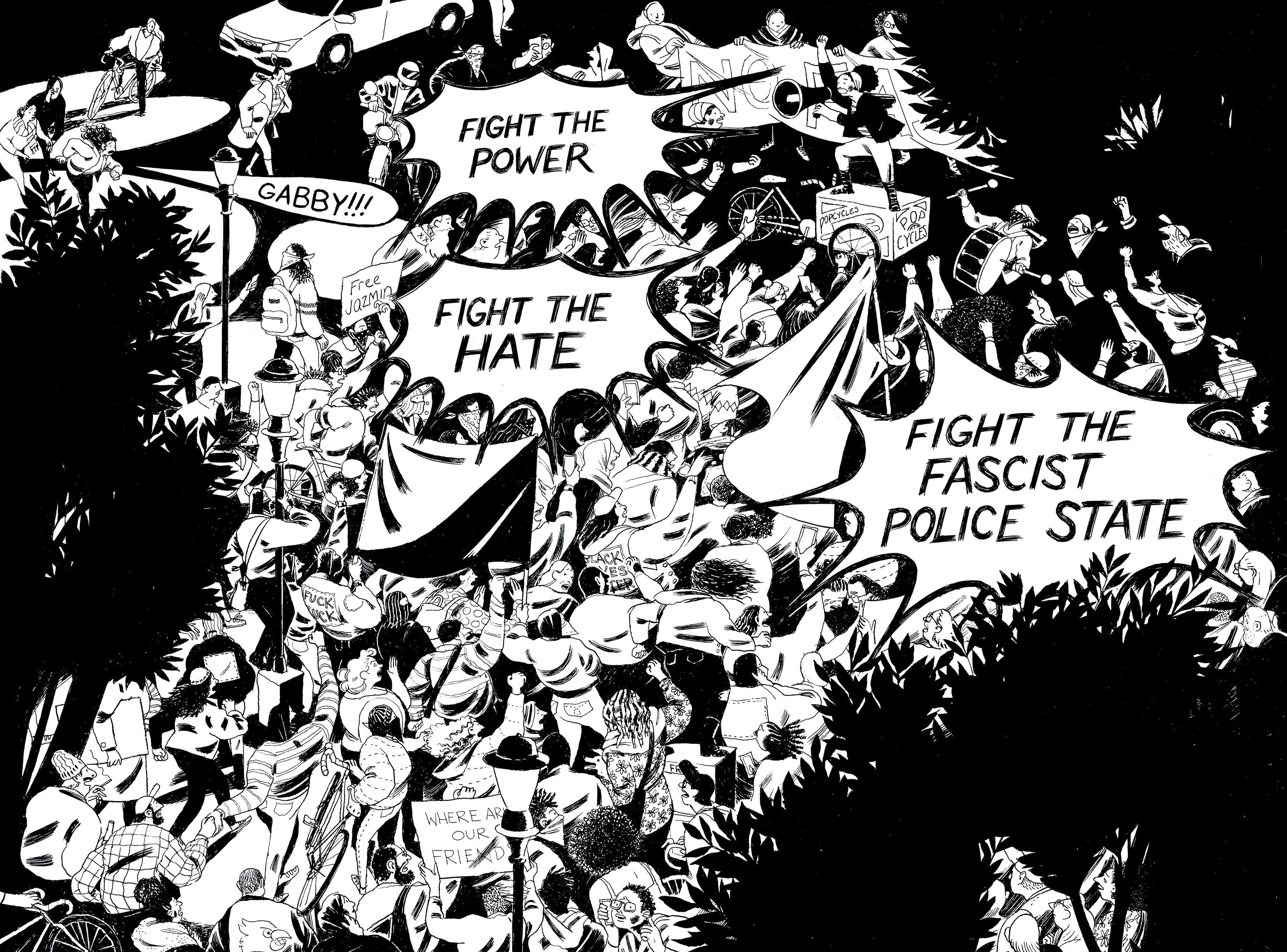
(courtesy of Drawn & Quarterly)
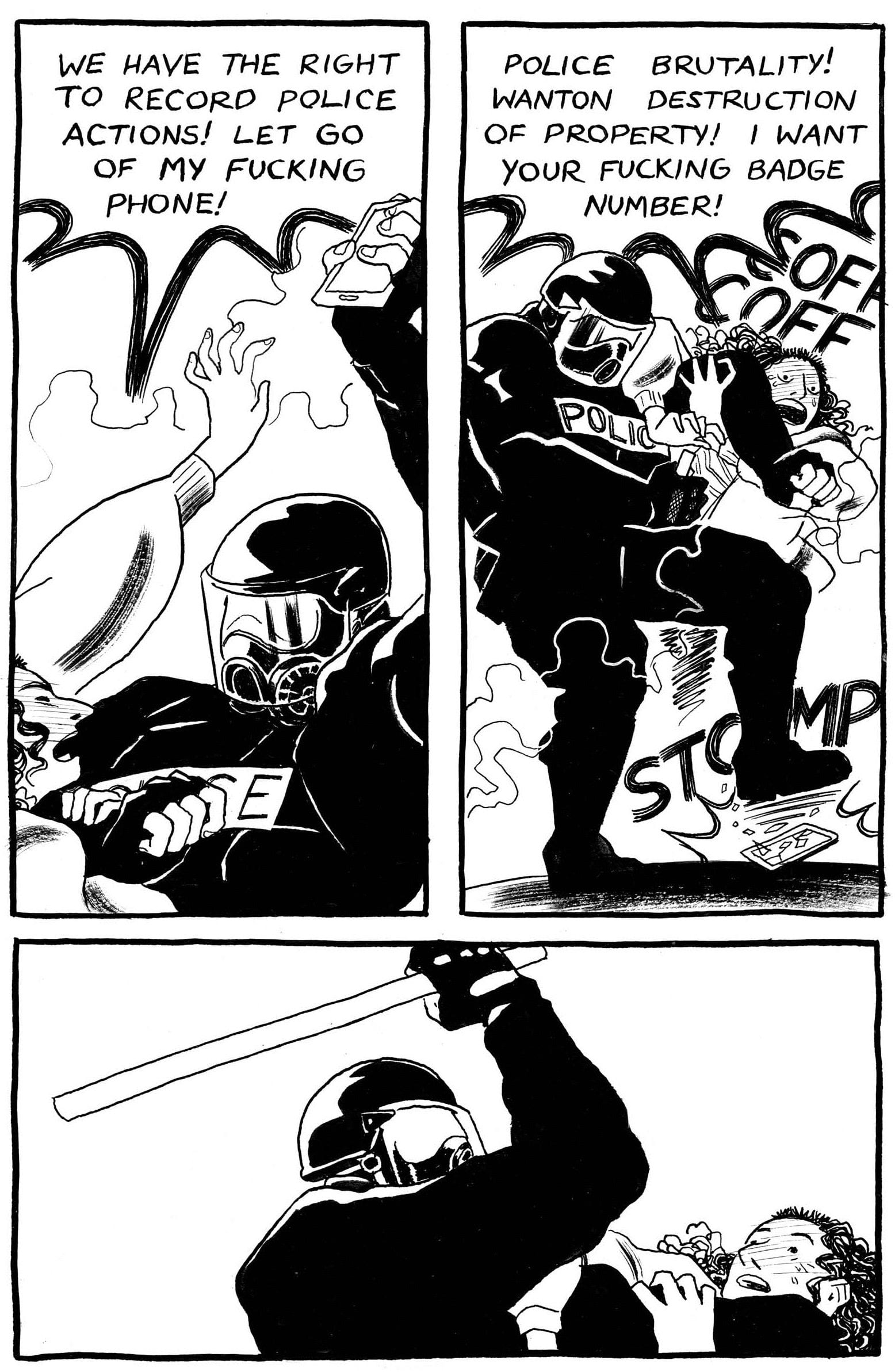
(courtesy of Drawn & Quarterly)
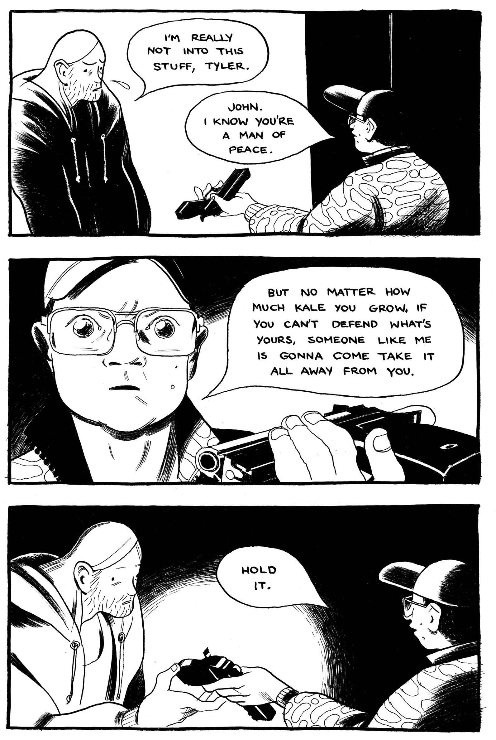
(courtesy of Drawn & Quarterly)
(courtesy of Drawn & Quarterly)
There’s another side plot with Jonny and his weirdo best friend. As lame as Johnny is, Davis rescues him with his refusal to fire his buddy’s gun at a female mannequin. This is after a full-page panel of Johnny holding the disturbingly detailed weapon in his hands, an image that communicates almost erotic desire. When he fires it into the air instead of at the target, the full-page panel is mostly white space. It’s a good moment, followed by a more disturbing one, since what goes up must come down. The novel’s second two-page spread is mostly white space too, with Johnny isolated on one side of the page gutter, and his dead friend crumpled on the other.
Manslaughter, riot police, alleged terrorists, lesbian adultery—if this is sounding melodramatic, it’s not. In fact, Davis’s most interesting narrative move is her eventual rejection of drama and narrative. When Hannah and Johnny reunite after their travails, there’s the requisite fighting and, yes, she finally articulates her earned frustrations with him, but then Davis largely abandons the plot. Not just that plot, but all of the plots.
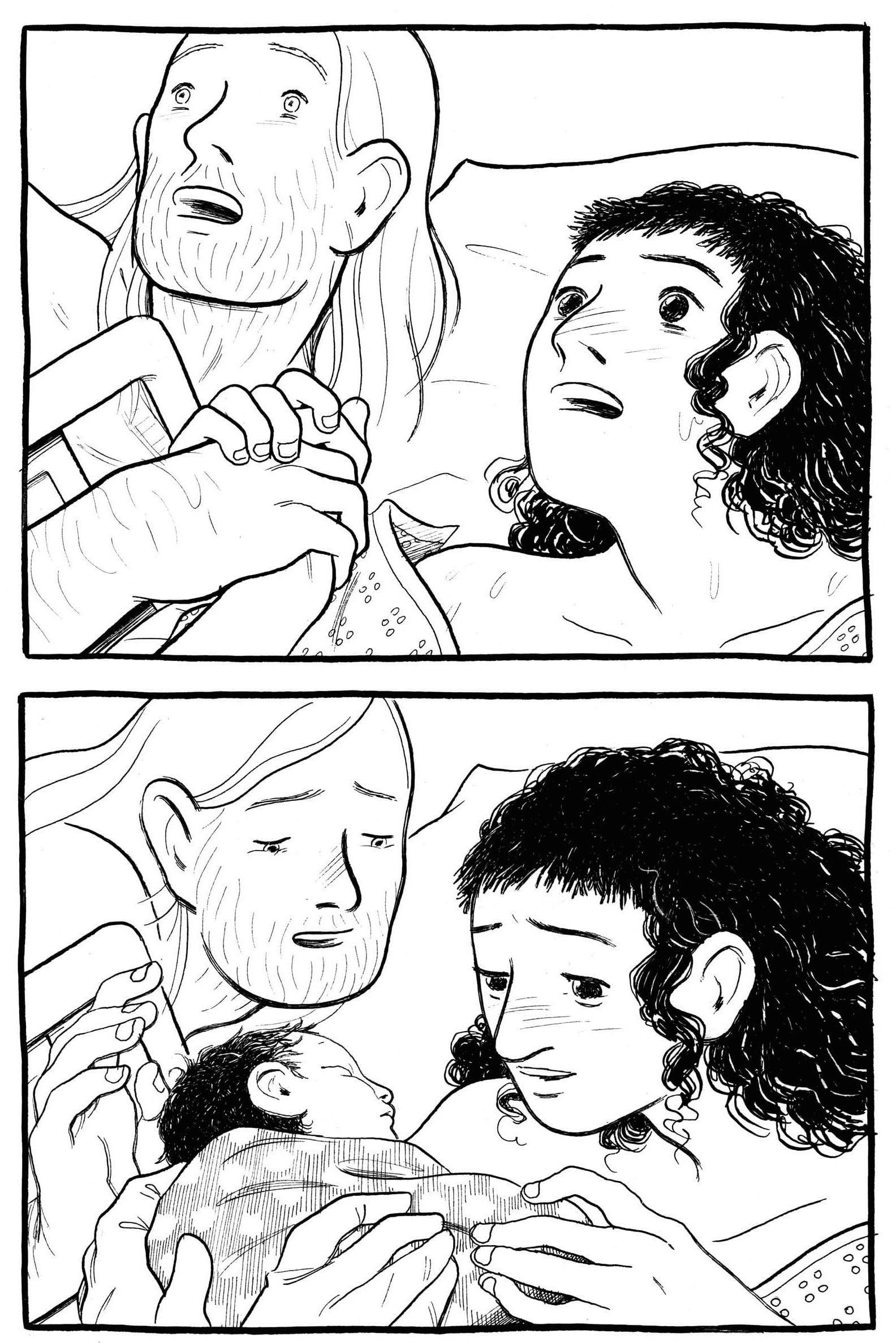
Time and pacing jerks forward to winter and pregnancy and then there we are — in hospital for the birth. Davis devotes ten pages not to standard birth-scene pushing and wailing — Hannah’s or the baby’s — but to the moments afterward. For five consecutive two-page spreads, the newborn sits on Hannah’s lap, effectively the reader’s lap from the angle Davis draws. The baby opens its eyes. The baby turns its head. The baby turns its head again. For ten pages. Time is revolutionized.
The preceding nine months only received eight pages, because these few seconds are literally bigger. Unbuilt houses, political unrest, romantic intrigues. Everything else is so tiny in comparison. Everything else is just plot. Davis shows us what matters.
Self-portrait (courtesy of Drawn & Quarterly)
- Eleanor Davis | Drawn & Quarterly
- Eleanor Davis on tour with The Hard Tomorrow! | Drawn & Quarterly
- OUR ARTISTS :: Eleanor Davis
- The Hard Tomorrow: Eleanor Davis: 9781770463738: Amazon.com ...
- Eleanor Davis (@squinkyelo) • Instagram photos and videos
- Eleanor Davis - Wikipedia
- Eleanor Davis (@squinkyelo) | Twitter
- eleanor davis / images |
![Call for Papers: All Things Reconsidered [MUSIC] May-August 2024](https://www.popmatters.com/wp-content/uploads/2024/04/all-things-reconsidered-call-music-may-2024-720x380.jpg)