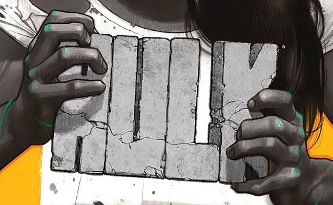

Mariko Tamaki’s Hulk premiered in January, and She-Hulk #1, which collects the first six issues, is out in July. While a newcomer to Marvel and superhero comics generally, Tamaki is a well-established and well-regarded graphic novelist, known especially for her collaborations Skim (2008) and This One Summer (2014) with her cousin, artist Jillian Tamaki. Mariko Tamaki has been praised for writing compellingly complex adolescent girls, a skill she brings to the adult Jennifer Walters, the former She-Hulk who drops the feminine prefix in exchange for a superheroic dose of repressed trauma.
While Tamaki’s character development remains impressive, Hulk No. 1 is perhaps most recognizably a Tamaki comic in its skillfully playful use of words—
— an unexpected link to the original The Incredible Hulk Nos. 1-6. When Stan Lee was editor-in-chief of Marvel in the ’60s, the job “writer” wasn’t about outlining plots or even telling stories. It was about writing actual words. Job applicants, including the later legendary Denny O’Neil, had to fill in four pages of empty talk balloons and caption boxes from Jack Kirby’s Fantastic Four Annual No. 2. More than plot or story, Lee wanted wit.
I doubt Tamaki had to take that or any other writing test to land her current Marvel gig, but she would have passed spectacularly. Hulk No. 1 highlights Tamaki’s signature style from its opening panels:
JENNIFER WALTERS’ CONDO, New York.
YES, IT COULD USE A CLEANUP. Back Off.
If the second line appeared in a talk balloon or a caption box attributed to a specific character, it would just be character-defining speech or thought. Instead, by repeating the font and borderless placement of the first line’s curtly omniscient narration, the same words surprise. Who exactly is talking to us? Walters presumably —
though not in actual speech, and maybe not in actual thoughts either? In prose-only fiction, we might call this “free indirect discourse”, where a third-person narrator takes on a character’s consciousness and speech style. But prose-only fiction doesn’t have the added complexity of multiple font styles linked to assumptions about voice and narrative structure.
Starting with the third panel, Tamaki’s captions feature Walters’ first-person narration in appropriately color-coded green caption boxes. She’s giving herself a pep talk:
Okay, Jen.
Get it together.
First day back. No big deal.
Though addressing oneself in second person is a common trope, superhero comics are premised on alter egos. Jen is literally two people. A fact Tamaki makes the most of as Walters cuts herself off as if interrupting a separate speaker.
It’s going to be fi—
How about shut up already? Stupid inside voice.
Are “Jen” and “Stupid inside voice” the same? Maybe. Or at least to the degree that the Jennifer Walters in human form and in giant, gamma-radiated Hulk form are the same. The two voices even vie for the same green caption boxes as Walters’ two forms vie for her identity.

Tamaki continues both motifs, with a later omniscient time marker (“TOO LATE TO STILL BE IN THE OFFICE”) and Walters’ internal conversation (“See?” “Everything is okay. Everything’s going to be fine.” “Thanks, voice.” “Thanks for the update. What would I do without you, voice?”). Wit aside, Tamaki’s use of words is not only character-developing, it’s form-challenging, revealing comics norms by quietly undermining them — an approach to “writing” that Tamaki honed in her earlier works.

Skim opens with text from the narrator’s diary, including a hand-drawn emoticon and a strikethrough:
My cat: Sumo [heart]
Favorite color: black red
The opening establishes the diary as the narrating premise, but the actual narration is more ambiguous. Though Skim’s words are from a diary entry, the white background of the comics page is not a representation of the diary itself — not till over 80 pages later when Jillian Tamaki draws a panel with Skim’s same handwriting but now across a notebook page with lines askew to the perpendicular angles of the panel frame. The detail highlights the ambiguity of all her narration. When, for example, she writes “P.S.” to begin the text of a caption box, is the postscript addressed to her dairy or to her comics readers?
When asked by a character how she broke her arm, Skim answers in a talk balloon: “I fell off my bike.*”
The asterisk links to the footnote-like caption box at the bottom of the panel: “(*Tripped on altar getting out of bed and fell on Mom’s candelabra.)”
How could the contradictory annotation appear in her diary? Similarly, when Skim passes a road sign announcing a town named “Scarborough”, her narrating self re-spells it “Scarberia” in gothic font. Again, is the physical writing Skim’s? If so, from what moment in time — an implied future when she later records the incident in her diary? If the word rendered in its very specific font is instead only her thoughts, in what sense can it be rendered at all? Can someone think in a gothic font?
Tamaki’s words exist in an in-between state, neither entirely physical nor entirely a free-floating consciousness. The most striking combination comes late in the novel, when Jillian Tamaki draws Skim writing enormous letters across the white snow of the page:
Dear Diary
I HATE YOU EVERYTHING
It’s snowing.
The first and third lines are rendered in Skim’s narrating font while the middle is a drawn image of her tracks in the snow. If we understand the narrating font as a literal diary entry, as the salutation overwhelmingly suggests, then Skim has only written the unremarkable statement: “Dear Diary, It’s snowing.” If the snow tracks are taken alone, then the “you” isn’t directed at her diary — and so not at a version of herself. While the other two meanings remain, the third emerges only in combination.
Tamaki is equally playfully with her scripted sound effects. While employing standard onomatopoeia with “Pop!” “Crack!” “Clic Clic” and “THUNK”, she edges into more ambiguous language with “sniff sniff” and “giggle giggle” — words that could still possibly evoke the sounds they linguistically define. But a pencil sharpener’s “GRIND GRIND” is less plausible, and a straw’s “stir” and “stab” impossible. Toes also “clench” and the word “apply” hovers beside a bar of deodorant as a character rubs it in her armpit.
According to comics conventions, all of these free-floating words should conjure sounds through pronunciation combined with the expressive size and shape of the letters. Though Tamaki’s words are instead descriptions, she and Jillian Tamaki still use letter rendering to communicate meaning with the word “swirl” written in atypical script beside the circles of motion lines inside a beaker.

This One Summer features many of the same complexities. The opening pages include the “crunch crunch” of feet on pebbles and the “bonk” of a book striking the back of a head, but soon Tamaki’s soundless sound verbs appear too: stab, nod, shrug, churn, off, wiggle, bounce, flop, push, dump, and inhale. In one instance, Jillian Tamaki even renders a sound effect misspelled with “gulg” written above a pouring drink. The reversed letters prevent the would-be pronunciation of “glug” from directly evoking the implied sound, instead using its visual placement only.
The word, like almost all of the Tamakis’ one-word effects, can easily go unnoticed, emphasizing the fact that practically any word, any clump of letters placed in the right sound-evoking area of an image, will register as the appropriate sound. The words then are primarily images. The Tamakis demonstrate that fact by placing musical notes across multiple panels to indicate a song playing from a stereo — an effect nearly identical to the use of the sounds letters “ticka ticka” over several later panels to indicate rain on the roof.
But sound effects are also more than their sounds. In the novel’s most striking use of language, Mariko Tamaki scripts the word “Slut. Slut. Slut. Slut.” behind the image of the walking protagonist’s flip-flops. The insult is in her thoughts after hearing older boys use it to flirt ambiguously with other, older girls. The sound effect then is not omniscient, the unassuming norm of most sound effects and so identical to all listeners. Instead, its’ a sound filtered through one character’s unmarked consciousness. Her flip-flops are calling only her a slut.
It may be unfair to attribute all of these word effects to Mariko Tamaki and not her cousin since they are all rendered in her cousin’s art — adding another ambiguity to the already complex play of language and art. Although I counted only one norm-bending sound effect word in the solo stories of Jillian Tamaki’s recent collection Boundless, artist Nico Leon only draws such standards as “CLICK”, “DING”, and “SHUFFLE SHUFFLE” in Hulk No. 1. Perhaps Marvel editor Mark Paniccia found Tamaki’s words too peculiar for mainstream fare, or Tamaki did, or the effects really are a hybrid product of her collaborations with her cousin.
Wherever they occur, the range of these quietly revolutionary image-texts reveal the Hulk-like duality at the heart of the comics form.
![Call for Papers: All Things Reconsidered [MUSIC] May-August 2024](https://www.popmatters.com/wp-content/uploads/2024/04/all-things-reconsidered-call-music-may-2024-720x380.jpg)