Popular poster art functions as landmark and lure, a commemoration and a drawing in. Rarely art for art’s sake, posters are rather objects with a more definite purpose or agenda: to announce an event, to persuade, to stir to action. Quoted in the introduction to Ballyhoo! Posters As Portraiture, print historian A. Hyatt Mayor describes posters as “pictures meant to be seen by people who did not mean to see them”, indicating the subtle subconscious action performed by imagery and typography.
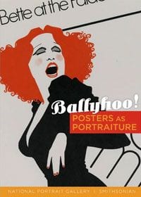
The images in Ballyhoo! are full-color reproductions from the Smithsonian Institute’s National Portrait Gallery. Accompanied by an informative, descriptive introduction and entries by curator Wendy Wick Reaves, the book is a compact historical survey of the medium from its earliest days as a proto-Wanted poster to the massive ad campaigns of today’s blockbuster films — from John Wilkes Booth to Johnny Depp, literally. Though the book’s subtitle stresses the portraiture aspect, many of the posters reproduced are as much about events as people, with wartime propaganda and social statement mixed in with entertainment. Overall, this is a condensed overview of the cultural landscape, with the 70 or so images serving as telling visible index.
Printmakers discovered early on, it seems, that mere information wasn’t enough, that the poster required some instant visual allure, a way of saying something; it needed layouts and images that were snappy enough to grab the eye yet sumptuous enough to reward extended viewing, and that were also able, in a way, to tell a story in truncated form without sacrificing vital narrative information. Some early posters combined sharp, declarative exclamations (“It talks! It sings! It laughs!” for Edison’s phonograph) with a bolder decorative design. Parisian influences such as Art Nouveau inspired some printmakers to create more florid, neo-Romantic patterns, like that for the opera star Lillian Russell, whose photographed face peers through a window-box like a flower bud surrounded by intertwining vines and leaves.
With the turn of the century and the influx of a more robust modernism, poster art, too, became more emphatic. From the face of “Buffalo Bill” Cody emblazoned on the side of his animal namesake with the block words I AM COMING stamped beneath, to a German poster depicting boxer Jack Johnson as a kind of dark, smooth piston, some poster artists began developing a style that was simpler in design, yet grander in concept. The painter K. M. Bara’s 1917 portrait of John J. Pershing for a You are Wanted by U.S. Army poster, plots the general, atop a scrubbed white mass of horse flesh, along the same internal axis as Romantic artist Jacques-Louis David’s Napoleon Crossing the Alps. This First World War image contrasts sharply with the later posters for the Second World War, which are more soberly economical and pragmatic, concerned primarily with quick recruitment — posters of Joe Louis or Clark Gable displaying a stoic resolve amidst simple, unadorned typography asking you to do your part.
Such transparent propaganda takes on more color in the Hollywood promotional poster. Included here are a very painterly 1927 poster of Douglas Fairbanks, some Art Deco and Bauhaus-inspired geometries of Buster Keaton and Frederic March, and, inevitably it would seem, some bright, lurid imagery for the Italian posters of Hitchcock’s Notorious, with a photograph of the director collaged over the painted heads of his kissing stars, or On The Waterfront, which turns the social melodrama into a horror film, with a zombified Marlon Brando leading dark hordes toward a broken, bloody meat-hook in the foreground.
Second only to Hollywood, music and musicians have inspired some of the most dynamic poster art. In the ’60s, with collectability on the rise, artists began creating elaborate pieces that were very nearly art for art’s sake, with conveyance of information almost subsidiary to artfulness of image. We learn here how the famous floating, mushrooming letters — perhaps still the most influential and instantly recognizable lettering technique — done by Robert Wesley Wilson for San Francisco’s Fillmore Auditorium vexed promoter Bill Graham for being so illegible; apparently, no one could see what was being advertised. Needless to say, what was being advertised was a psychedelic experience of which the poster could serve as either impetus or focus.
Besides rock posters, there are some very fine jazz-inspired images which, without the lettering or typography, make good artworks on their own, among them Avi Farin’s liney Dizzy Gillespie (1979), and Seymour Chwast’s Rouault-like Count Basie And Band/Stan Getz And Quartet(1963).
Indeed, one thing this book demonstrates is how early on and how steadily so-called high and low art influenced or informed one another, and the extent to which each benefited from the blend. Any great visual artist, printmaker or otherwise, exhibits a strong sensitivity to form, process and materials. So as poster artists were able to develop and apply a kind of stylistic shorthand version of big, painterly ideas like cubism or collage, artists from Picasso to Warhol appropriated, in some ways, the seductive, declarative graphic layouts of commercial art. Represented in this collection are such major artists as Larry Rivers, Ben Shahn and Robert Rauschenberg, with posters for George McGovern, Harry Truman and Thomas Dewey, and Lane Kirkland, respectively.
If the posters in Ballyhoo! are “pictures meant to be seen by people who did not mean to see them”, the work in the oddly, aptly titled 1 of 1500 (as in “limited edition”) has a slightly different agenda. The book reproduces a number of hand silk-screened posters designed specifically by the JDK/Iskra Print Collective for the Vermont musical venue Higher Ground. I’d never heard of, let alone been to the Higher Ground, but perusing this book makes me want to go, and not only for the music. Apparently these posters are handed out at select shows, and I can only imagine how appreciative an audience member would be to receive one of these beauties.
I know people who have nearly every flier from every punk show they ever attended, and though these posters are much more than Xeroxed magic-marker jobs, in their dissemination and collectability they have the same personal value and edgy charm or charge — something to be cherished, a material memento of an ephemeral event, an artful reminder of that one show at which you were lucky enough to be a celebrant.
Some of this has roots in the mad, proliferate ballyhoo of Barnum & Bailey’s circus, where “thousands of sheets of paper” announcing the upcoming spectacle were plastered over any and every surface. Nothing is more like a circus than a traveling rock show: transient gigs full of tear down and set-up, with rollicking pay-offs in between. Such transitory performances require an announcement appropriate to the event, and if 1 of 1500 does anything, it shows how great designers are inspired to develop appropriate imagery quickly and on commission.
Along with numerous full-color reproductions of the posters, and performance photographs, are included comments from the various designers themselves, as well as some responses from band members. These client comments range from the generous (Trey Anastasio: “We have a long history of collaborating with JDK. They are cool because they always have some sort of abstract reference to the artist or event…”), to the comic-oblique (M. Ward: “I’m not sure if it’s suppose to be a Rorschach test, but I see a blue hippo with red lips.”), to the not-so-generous (The Pants: “A bunch of hangers? You gotta be kidding me…”). The designer commentaries are a welcome compliment to the images, extending the pictorial into something more personal and anecdotal, or explaining technique, intention or otherwise hermetic ideas.
Graphic inspiration comes from anywhere. There are explicit lyrical references or riffs on song and band names, and more abstract, instinctual processes, such as designs based on feelings, or those visual apparitions that involuntarily arise when listening to music. Nearly all the posters, including alternate concepts, have a graphic energy that counterparts the performers or performances. Though obviously slicker and far more professional than any of the old punk one-offs, there are remnants of a punk sensibility in some of the designs, with disjointed layouts full of scribbles, scrawls, collage and graffito.
Also evident is a keen art-historical sense. Inevitably with silk-screen one immediately thinks Warhol, and there is much of Warhol’s unerring sense of color and space in many of these designs (such as an eye-popping J.J. Cale poster) but there is other Pop as well — for example, drippy-trippy Lichtensteinian dots forming the Jewish hip-hop artist Matisyahu. Another poster looks like a Cy Twombly, with a gray blackboard background and gun-wielding turtle chalked in. There are Surrealist-inspired collages, Russian Constructivist constructions, spirographs and Man Rayographs, and jazzy Stuart Davis cubisms. There are also digital images full of linear circuitry, and analog images that look hand-drawn.
Humor is perhaps the overriding element, with the band Ween receiving a fair amount of jokes, including a very beautiful three-color poster showing a little girl’s pink legs standing in a yellow pee puddle, and another of a Charlie Brown ghost with a hard-on. There is also an elaborate, interactive They Might Be Giants poster that looks like the fold-in at the back of Mad Magazine.
The original posters in both Ballyhoo! and 1 of 1500, however popular their origins, have now become collector’s items of various rarity. If you’re not lucky enough to own one or any of these original posters, than I guess being one of the 1,500 or more to own one or both of these slim, dense volumes is the next best thing.
![Call for Papers: All Things Reconsidered [MUSIC] May-August 2024](https://www.popmatters.com/wp-content/uploads/2024/04/all-things-reconsidered-call-music-may-2024-720x380.jpg)