If Picasso had drawn comics, they might look like Manuele Fior‘s Red Ultramarine. If that sounds like ridiculously high praise, it is. But some caveats: I mean “drawn” not “painted”. Late in his career, Picasso changed to minimalistic line drawings that no art critic has ever, to my knowledge, called “cartoons”. And yet they meet the definition well: simplified (no depth-producing cross-hatched shadows, just the fewest pen strokes) and exaggerated (expressively stylized and so distorted contour lines instead of reality-reproducing ones). Look for yourself: PabloPicasso.net.
Second caveat: Picasso is known to have been a sexual harasser, sexual assaulter, and statutory rapist , but thankfully, Fior’s art is not infused with that same misogynist energy. I say that despite the two female nudes featured in the first five pages. Though Fior’s artistic eye never lingers so adoringly on any of the male figures in his novel, none of which are ever nude, the opening images take a complex meaning within the surprisingly sprawling (only 150 pages, yet such interlocking time periods and plots) scope of the novel.
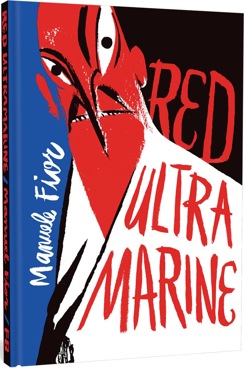
It’s rare to find a comics creator, or even a pair of writer and artist collaborators, who produce a work that is as equally impressive visually as it is narratively. Fior originally published the novel in 2006 as Rosso Oltremare, which Jamie Richards translated from Italian for the new Fantagraphics Books edition. The publisher also brought Fior’s 5,000 Km Per Second to English readers in 2016. There, Fior works in watercolors, an evolution of style that the English publication order reverses, since Fior drew the more minimalistic Red Ultramarine first.
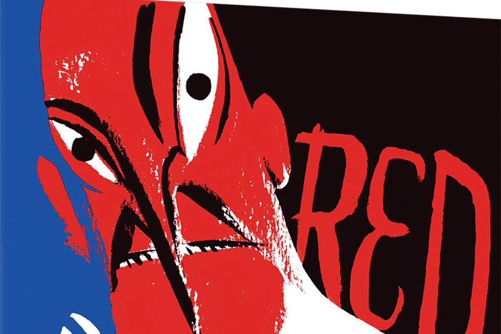
The novel epitomizes artful restraint by using only two colors: black and red. I’m not certain of Fior’s medium (the intentional patchiness of the reds suggest print-making to me, but the blacks tend more toward opaqueness), but it results in thick, expressive lines and shapes that push well beyond mere information-communicating illustration. Much of the novel’s power, and so meaning, is at the level of the brushstroke and the energy it conveys about the story world.
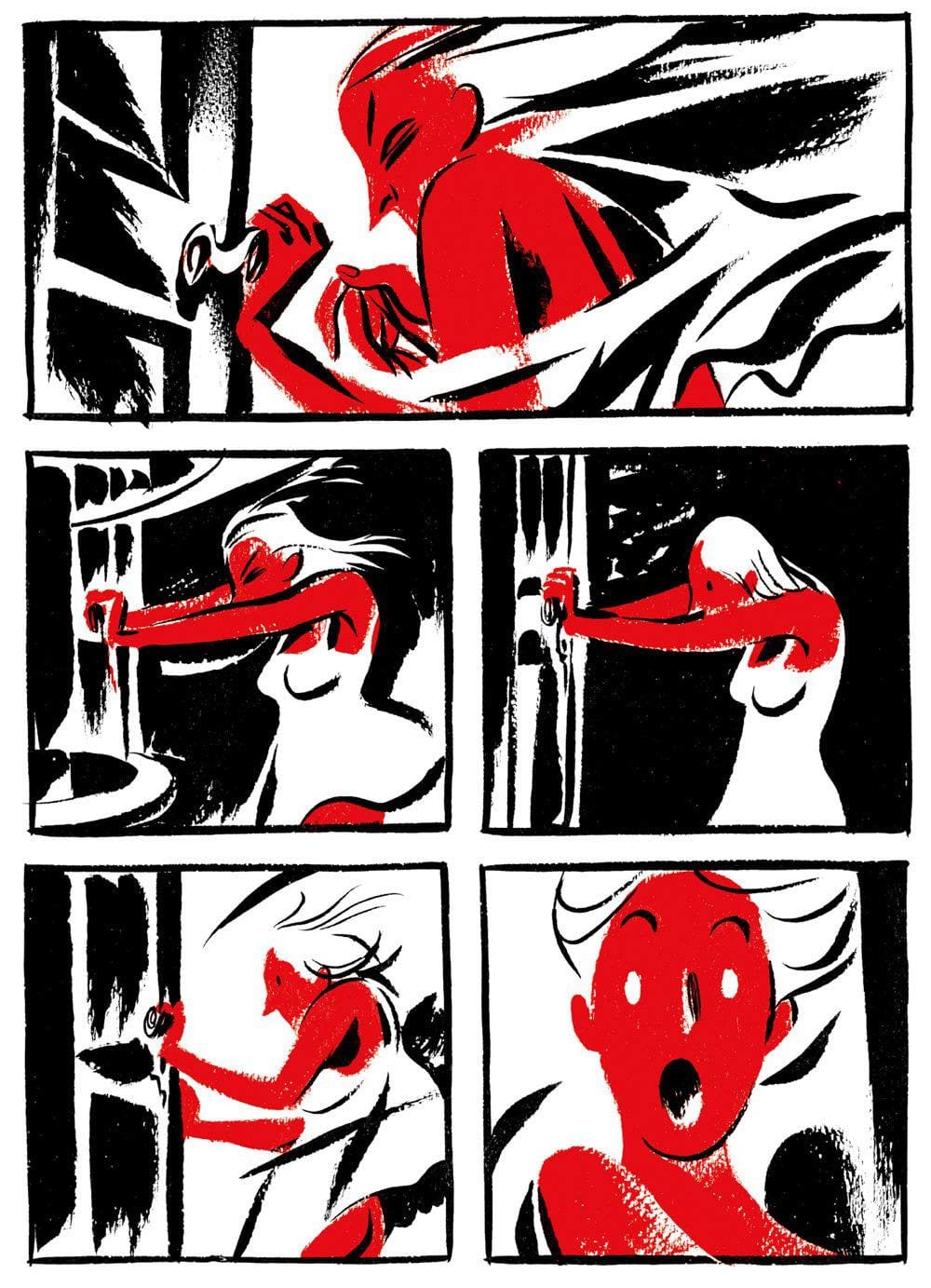
The two-tone approach and lack of depth-clarifying crosshatching sometimes turn panels into visual puzzles that must be paused over to decode, especially when motion lines and emanata are rendered in the same gestural style as physical objects. Fior is wise to draw consistent black frames in predictable layouts of two and three rows, each row a page-length panel or divided in half (except for the full-page panels opening half of the eight chapters). The orderly structure offsets the more anarchic panel interiors.
Once in a great while I still found an image that I could only partially decode, an indication that its abstract qualities (the directions of the strokes and the complexities of their overlaps) are more important to meaning than what they represent at a literal level. The style slows “reading” by encouraging and rewarding careful attention. While Red Ultramarine is far from abstract expressionism, it is a pleasure to find an artist-writer who regards the art of his images to be equal to the narrative they convey.
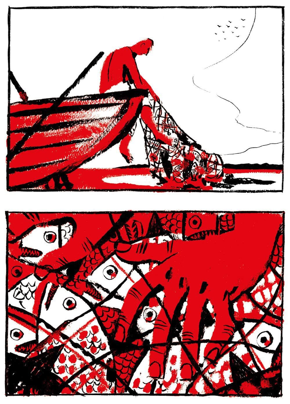
And those images do tell a hell of a narrative, or two interlocking ones that, like the artwork, are pleasantly difficult to summarize. The back cover would have us believe that this is the tale of a mad architect (inspired, I assume, by Fior’s own degree in architecture) and his girlfriend Silvia’s attempt to save him. And it is that—and yet the first 18-page chapter takes place in mythic Greece and features a very different architect, the labyrinth-building Daedalus, and his son Icarus catching fish on the shores of Crete. Fior doesn’t insult his readers’ intelligence with setting-defining captions but instead lets the father-son dialogue slowly reveal all we need to know. The second chapter then leaps without explanation to a contemporary European city (Paris? Rome? I’m not sure, but Fior includes architecturally specific buildings that I suspect a more cosmopolitan reader could identify), and then, because of the vacillating chapter structure, we don’t even meet Silvia’s boyfriend until chapter four—which is the only chapter in which he appears.
The story centers on what Silvia comes to call a “strange correspondence”, in which characters and time itself are doubled. While Silvia’s boyfriend has an uncanny resemblance to Icarus, the doctor she begs for help in the contemporary setting looks identical to King Minos, the villain who throws his imprisoned architect into his own labyrinth in revenge for the death of his son, the monstrous Minotaur. (Most of that action occurs off-page, so readers might want to do a quick brush-up on the original myths.)
The correspondence also extends beyond Greece to the comparatively recent folktale of Faust as interpreted by the German poet Goethe, who is quoted twice in the text. Not only is the Doctor/Minos a variation on Mephistopheles, Silvia’s boyfriend is named Fausto. Given the inevitable fate of his twin-self Icarus, not to mention the damned Faust’s fate, you might assume a bad ending awaits the young architect. But Fior’s blueprints are more complex, preferring suggestive ambiguity over definitive closure.
There’s plenty more to pore over—a cryptic birthmark, a magic time-travel ointment, an age-changing assistant, even a metaphoric justification for Fior’s artistic style when Deadalus reflects on how he designed the labyrinth: “making any point of reference uncertain, tricking the eye with winding passages.” The art and the story are similarly uncertain, with the reader/viewer’s eye and mind repeatedly tricked while wandering Fior’s passages.
I’ll end instead on the cryptic title. It references not red and black, the novel’s color motif, but red and blue—and so a color that only appears on the cover. “Ultramarine” means “beyond the sea”, a reference to Afghanistan where the gemstone lapis lazuli was mined and then imported to Europe to be ground into the blue pigment first used by Renaissance painters. While Fior’s gesture toward a color his visual storytelling does not include could suggest a great many things, I experienced a metaphorical going-beyond of the surface world or worlds of the novel, as its story wandered into ambiguous territory, the undefined spaces beyond Fior’s gutters. It’s a disorienting mental and visual space, more difficult to map than most comics labyrinths, but also more rewarding.
![Call for Papers: All Things Reconsidered [MUSIC] May-August 2024](https://www.popmatters.com/wp-content/uploads/2024/04/all-things-reconsidered-call-music-may-2024-720x380.jpg)